lt's easy to recognize the artistry in a good book cover, but book interiors require at least as much attention. In this case study, I explain my process for the interior design for an anthology that seeks to showcase some of the best fiction and poetry published in New England. The book, Best Indie Lit New England (BILiNE), is a joint project by the editors of a number of independent arts & letters journals in the New England area. I took it on myself to design an interior for the collection, which will be released later this year.
A disclaimer: Although I consulted a variety of sources preparing this design and strived to make well-informed decisions about things like typeface, column length, and so on, I am not a professional book designer. I am bound to have made some gaffs along the way. That said, I wanted to share my process in order to demonstrate the kinds of decisions that go into a thoughtful book design.
Page Size
The first consideration for a book project has to be the page size and format. What shape is the book going to be—a horizontal or vertical rectangle, a perfect square, or something else entirely?
For this project, that decision was easy. A typical size for a trade paperback is 6” X 9”, and no matter what printer we contract with there shouldn’t be any trouble with those dimensions. We’re not making an image-heavy art book or the like, so there’s no harm in going with something conventional.
Typeface
Because the collection has a limited geographic scope, work published in New England, I wanted the typeface for the body text to have some connection to the region. I went to my most trusted source on all things typographical, Robert Bringhurst’s The Elements of Typographic Style. In the back of the handbook, Bringhurst provides a list of type designers with concise biographies. I identified three designers with clear connections to New England: Michael Carter (1937–), William Addison Dwiggins (1880–1956), and Bruce Rogers (1870–1957).
I was initially attracted to Electra, a modern face designed by Dwiggins in 1935. It’s thought to be a particularly good face for setting poetry. I also liked the idea of using a face that sought to strike out on its own (i.e., was not based on a historical precedent), for a collection of work by independent publishers.
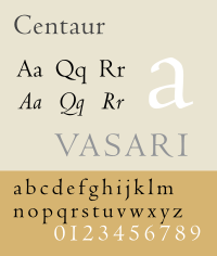
 I also considered Centaur, Rogers’ reinvention of a roman typeface cut by Nicolas Jenson. The face was commissioned by the Metropolitan Museum of Art in 1914 and I liked that association as well given the noncommercial, art for art’s sake nature of many of the BILiNE publishers.
Both Electra and Centaur are beautiful typefaces with rich associations. Unfortunately, after doing some additional research, I learned that both require letter-press printing and high-quality paper to bring out their best features. Anything less and their delicacy is muddied, and their advantages become obstacles to legibility. I don’t know the exact printing parameters for this book yet, but given the limited budget, I decided it was a bad idea to rely on faces that might wilt under less-than-ideal conditions.
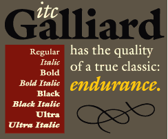
 Taking all this into account, I chose Galliard, a more robust face, for the body text of the book. Galliard was developed in 1978 by renowned typographer (and current resident of Cambridge, Massachusetts) Michael Carter. I had encountered this face in use once before, as the body text for the literary magazine The New England Review. As far as I can tell, Galliard isn’t much used in book publishing despite its merits. So, I had found a font with a New England association, one that hadn’t already been over-used, and one that could be printed on a wide variety of papers and with different printing techniques and still retain its legibility and character.
A Digression: Typeface vs. Font
I next had to acquire a version of Galliard that would have all the special characters I needed. You may already know the distinction between typeface and font; if so, feel free to skip this next part.
So, I had chosen a typeface, but not a font. In her very excellent book Thinking with Type, Ellen Lupton defines the distinction between typeface and font in this way:
A typeface is the design of the letterforms; a font is the delivery mechanism . . . In digital systems, the typeface is the visual design, while the font is the software that allows you to install, access, and output the design. A single typeface might be available in several font formats.
There are several fonts of the typeface Galliard. Some are better designed than others or have more features. I had a freebie version of Galliard, but went ahead and purchased ITC Galliard Pro from Adobe because this version, an OpenType font, had some special features I thought I would want: true small caps, old style figures, and a selection of glyphs.
Type Size & Leading
The next choice I needed to make was what size to set for the type and the leading (the amount of space between each line of text). I decided on ITC Galliard Pro 10/14pt (10pt font size, 14pt line spacing). I chose 10pt because, although we may tend to think of 12pt as default because of our familiarity with word processing programs, most faces designed for body text are printed in sizes from 8.5 to 10pt (at least when the text is intended for adult readers).
Why so much space between the lines, though? Galliard is a tall face and takes up more space at 10pt than some other faces do. Typefaces have a number of characteristics that make them unique. One of these is x-height. Probably the easiest definition of x-height is that it’s the height of a lower case “x” (a character that doesn’t poke up or down like a “b” or a “p”). Lines of type set in faces with large x-heights (Helvetica is a good example) require more space between lines than lines set in type with smaller x-heights. Otherwise, they look crowded on the page and become uncomfortable to read.
Text Block
Once I’ve determined the page dimensions and the typeface, the next decision is what the text block should look like. Because the prose in this collection is going to be literary fiction, I decided on a single column of text on each page. This isn’t a newspaper or a magazine—with multiple columns, images, and captions to worry about. Best in this case to stick with what readers have come to expect from reading short stories and novels.
So, a single column of text for prose, but how big should it be and what shape?
Since the ratio of the page size (6X9) is 2:3, it would be visually boring to replicate those same proportions in the text block.
In went back to Bringhurst’s book for models of aesthetically-pleasing proportions for text blocks. I decided on a ratio for the text block size that corresponds to that of a tall pentagon instead (1:1.701). Pentagonal proportions have a kind of organic beauty to them. Pentagonal geometry, Bringhurst notes, is basic to many living things (starfish and roses, for example).
I also needed to make a decision at this point about the alignment of the text. I’ve observed that most of the literary books I read are set justified—the text forms a neat block with lines of approximately same length. I went with justified text with the last line of each paragraph aligned left.
This looked awful at first, but then I adjusted InDesign’s justification and hyphenation settings so that it didn’t leave such big, ungainly spaces between words or hyphenate too many words at the end of lines or break them at awkward places. Finally, I set a paragraph style for those paragraphs that would need to be indented. I wanted this indent to be harmonious with the rest of the design, rather than arbitrary (e.g., 5 hard spaces). I decided that the left indent should be the same width as the leading, 14pt (1p2).
I decided on a width of 25 picas (12 pts = 1 pica) for the text block. I arrived at this width by taking a look at ITC Galliard Pro at 10pts. At this width, a line of text ends up being roughly 65 characters to a line. For engaged reading, 65 characters per line is considered optimum.
For this project, the length of the text block (based on that pentagonal ratio) results in about 40 lines to a column. This is approximately the amount of lines per page you'll find in most novels published today, so that’s perfect. All in all, readers should find the text very readable (without having any idea why, of course; the design shouldn't call attention to itself here).
I positioned the text block more-or-less by eye, following the convention of having larger outer than inner margins on facing pages and larger bottom than top margins. Once the text block was in place, I adjusted InDesign’s margin settings to conform to the dimensions of the textblock.
Once I had the margins established, I setup a baseline grid so that my choices about the positioning of any other elements (illustrations, etc.) would be systematic rather than arbitrary. My grid is relative to the top margin, with horizontal lines running across the page every 7pts. I chose 7pts because the space between the lines of text (leading) is 14pts (and so divisible by 7). I also visually divided the page into six columns. I expect that the text block will usually take up all six columns, but if I put in an illustration or something, I want a grid to fit it into (e.g., make it two columns wide, say, and 10 gridlines long rather than just dropping it in there arbitrarily). I’m not very good with math and grids and the like, so I found the designer Nigel French’s training Designing A Magazine Layout very helpful. In the training, he’s talking about using InDesign to design a magazine, but the principles are the same and it's nice to be able to see how he implements his choices in a specific software program, working on a particular project.
There’s more to do—I need to decide on a contrasting typeface for headings and subheadings, decide where page numbers will go, what glyphs or images to use for section breaks or to indicate the end of a piece—but having gone through this process, I now know what a typical interior page for a story printed in the book will look like. You can have a look at a PDF of my work-in-progress page here.
